
San Diego Zoo
App Redesign Case Study
The San Diego Zoo is a world famous wildlife nonprofit conservation. With 4 million visitors in 2018, it is a destination for tourists and locals alike. Between its 100 acre footprint, 12,000 animals, and 650 species and subspecies navigating this park and exploring it to its fullest may pose a challenge to even the most seasoned zoo member. To aid this, the San Diego zoo has released a navigational app with the goal of helping visitors quickly navigate to the wildlife, dining, or shopping experiences of their choice. Using this goal as the minimum viable product, this case study highlights some key changes the zoo could make to their app to improve its usability.
The Redesign

Many of the reviews on the app store are actually about the user’s experience at the San Diego Zoo, not their experience using the app. This is giving the Zoo app inflated ratings.
The Challenge
After pulling the last year of written reviews from the Apple app store the San Diego zoo app looks as if it has good reviews. However, upon closer inspection, all of the five star reviews are actually about a users review of the zoo itself not their experience using the app.
Methodology
This case study implemented a user interview and usability testing to uncover any initial problems with the app. Our user is a San Diego resident, longtime member of the San Diego Zoo, and downloaded the Zoo’s app one year ago. Our user was asked to open the app, choose an animal, and use the app to navigate to its enclosure. After testing the app he participated in a qualitative interview on his experience with the app. The qualitative interview was then cross referenced with the written reviews left on the apple App Store over the last year to gain a more comprehensive understanding of where the users may have found problems with the current app.

Issue #1
Map Icons
The map icons currently do not scale down based on the zoom position. The user may have difficulty locating themselves under the icons in a zoomed out state. The icons are also all exactly the same size, color and shape so it lacks visual hierarchy. Hicks Law states that the more options or stimuli a user is presented with, the longer it will take them to choose their next action. Additionally we can look at Fitt’s Law which is the function of distance to the target and size of the target, given that all of the icons are the same size, there is no indication to the user to sort through and click the correct icon.
Left: Current zoo app home screen
Right: Selection of App store reviews
Solution to Map Icons Issue

1 – When the user opens the app they are automatically shown a zoomed in view of where they are.

2 – As they zoom out like objects are grouped together in to tags. This shows the user how many attractions are in an area while keeping the map clean.

3 – If the user zooms out to a full park view objects are grouped by the park zones used on the zoo’s paper map.

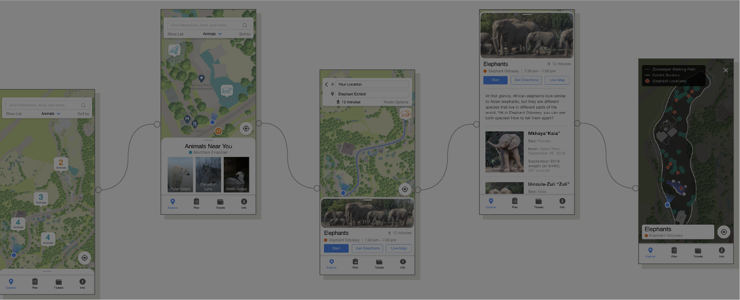
Issue #2
Map Menus
When users first open the map the only navigational icons available to them are for wildlife. The map currently only supports showing one category at a time. So, the app has 11 different map views that the user must sort though. If they click in to a new category the app also zooms out to a full view of the map instead of holding it’s position.
Quote From Qualitative Interview
“…why can’t I just zoom in on an area and it just tells me the restaurants that are there why do I have to go and pick an area? Like here I am I just zoomed in and See these buildings but I don’t know what they are. And then when I just press dining to see what it was guess what, it just zoomed back out and now I have the whole zoo again”

Solution to Map Menu Issues
All 11 sections could be integrated in to one baseline map. To keep the map from becoming cluttered the user could select a one of the original menus as their primary information. This information would be the most prominent but they could still reference and click on the other categories if they are zoomed in far enough. The map would also stay in the same place if the user selects a new category.

Issue #3
Map Display
There are a few visibility issues with the map as it stands. The current map display does not support level navigation. This came up as an issue in the qualitative interview as well as in the quantitative app review data pull. The map also does not include some of the key features of the zoo’s paper map such as park zones or navigational signage. Additionally, the current map’s coloring is not 508 compliant.
Quote From Qualitative Interview
”…But there’s a case where again this is where the map has flaws. Because we didn’t realize we had to go over a bridge. Because the bridges are not — elevations are not indicated on the map so it was very confusing”.
Solution to Map Dispay Issues


